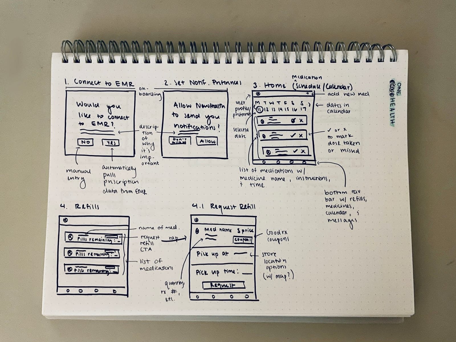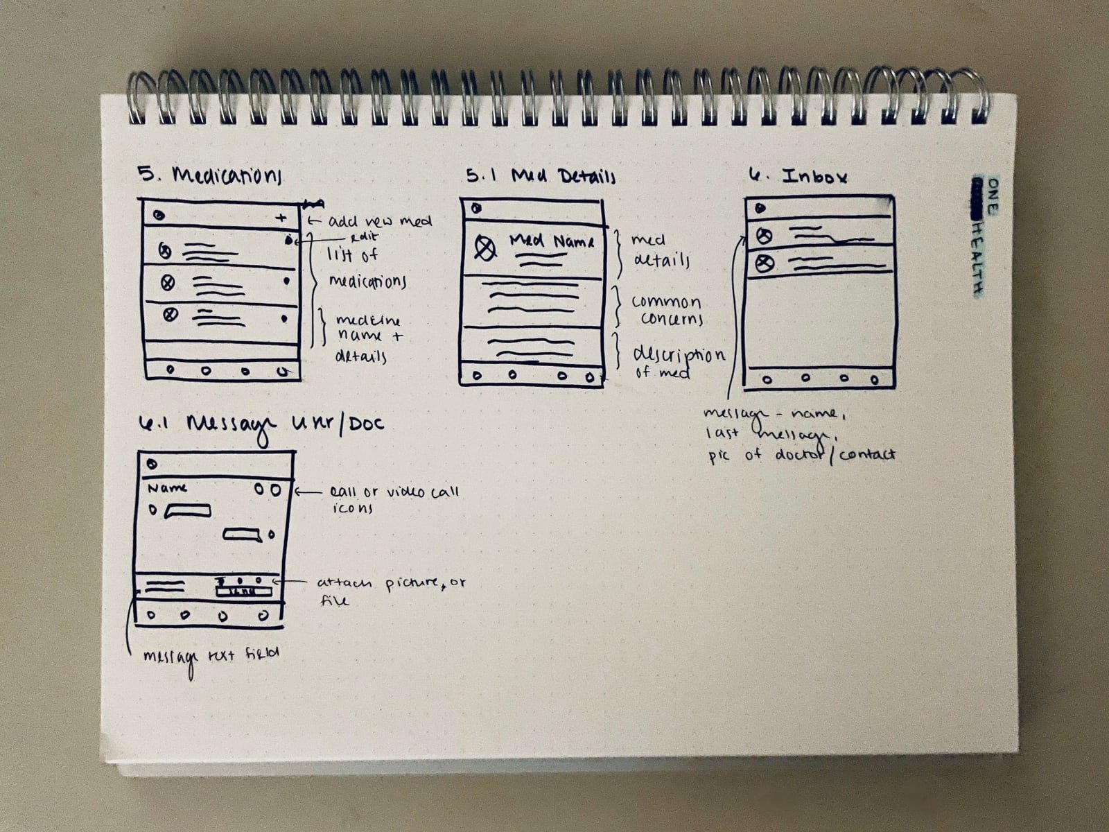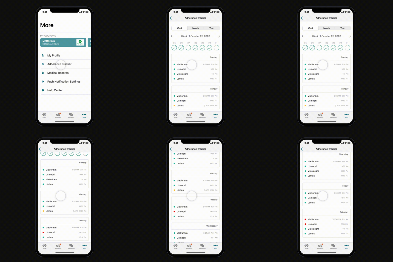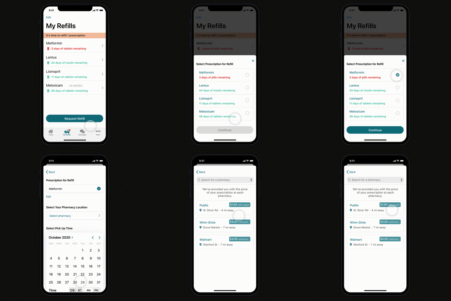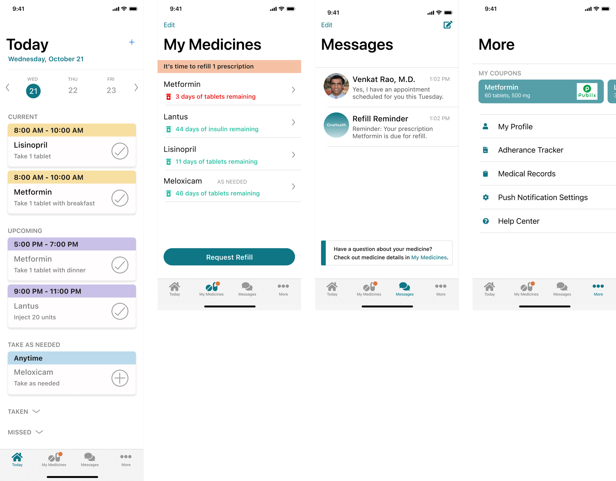
Medical App Design
Background
This is a self-started project in collaboration with a local physician with the motivation being, every year medical non-adherence accounts for about half of failed treatments, thousands of deaths, and billions of dollars in avoidable healthcare costs in the United States.
Problem
Currently there is no digital or online access to help patients with their medication reminders or manage their prescription.
Solution
Design an app that encourages medication adherence and streamlines medical management.
My Role and Impact
Scope: Research, UX, UI
Duration: 156 hours
My part is in the process was working collaboratively on the new responsive application research and design along with assets from the illustrator and guidance from a local physician. I worked within the hospital’s new brand guidelines and iterate according to the feedback from the stakeholder I was getting during weekly meetings.
Research
In order to determine how to best help medically non-adherent patients, I had to take time to explore the context.
This project will target unintentional non-adherence, which accounts for roughly 30% of non-adherent cases.
Unintentional non-adherence occurs when a patient wants to take their medication as instructed, but encounters barriers that prevent them from doing so.
69% of non-adherence is due to behavioral issues, such as forgetfulness, not knowing how to take a medication, or confusion around complex dosing schedules.
16% of non-adherence is due to high prescription costs.
15% of non-adherence is due to side effects.
"Interventions addressing this type of non-adherence may need to focus on simplifying the regimen, reminding patients to take their medication, and supporting patients in making the intake of medication part of their daily routine.”
A key limitation of the market is that adherence apps put a huge burden on the patients to enter and manage their prescription data, and most require manual data entry by patients.

STEP 1: Subject Matter Expert Interview
Interviewing a primary care physician allowed me to gain a more intimate understanding of the experiences of non-adherent patients and consequences of non-adherence.
The majority of his patients, many of which are non-adherent, are Black/African-American, low-income senior citizens. This aligns with research indicating that predictors of non-adherence include minority groups and socioeconomic factors.
Healthcare is disjointed.
There is a need for streamlined communication between physicians, pharmacists, insurance companies, and patients - all of whom share the goal of medication adherence. Fragmented and uncoordinated care is a driver of non-adherence.
People who are non-adherent lack the time/energy to use adherence apps.
People who are non-adherent are typically deterred by the length it takes to manually input and update medications into an app. The majority of people who use adherence apps are already compliant to begin with.
Missed prescription refills lead to lost money and extra resources.
Physicians hire extra staff to keep track of patient refill statuses. Insurance companies also send physicians reminders to contact patients with missed refills. Additionally, missed refills cause physicians lose thousands of dollars annually in quality bonus payments.
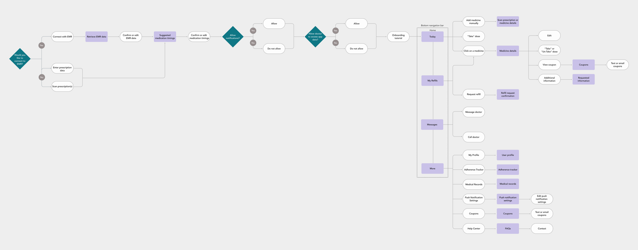
STEP 2: UX For Seniors
After completing my subject matter expert interview, I realized that it was important for this app to be accessible to elderly individuals who may not necessarily be "tech-savvy."
After studying UX for seniors, I found the following are important to optimize the technology for seniors:
Use large text (minimum 12 pt. on mobile)
Use high contrasts
Avoid multiple fonts and use clear content hierarchy with type weight
Pair symbols with text
Make interfaces flexible and forgiving
Make user flow logical and sequential, perhaps with guidance
Provide reminders/alerts to cue habitual actions
STEP 3: Persona
Using insights from both my subject matter expert interview and topic research, I created a persona that reflected my target user base.

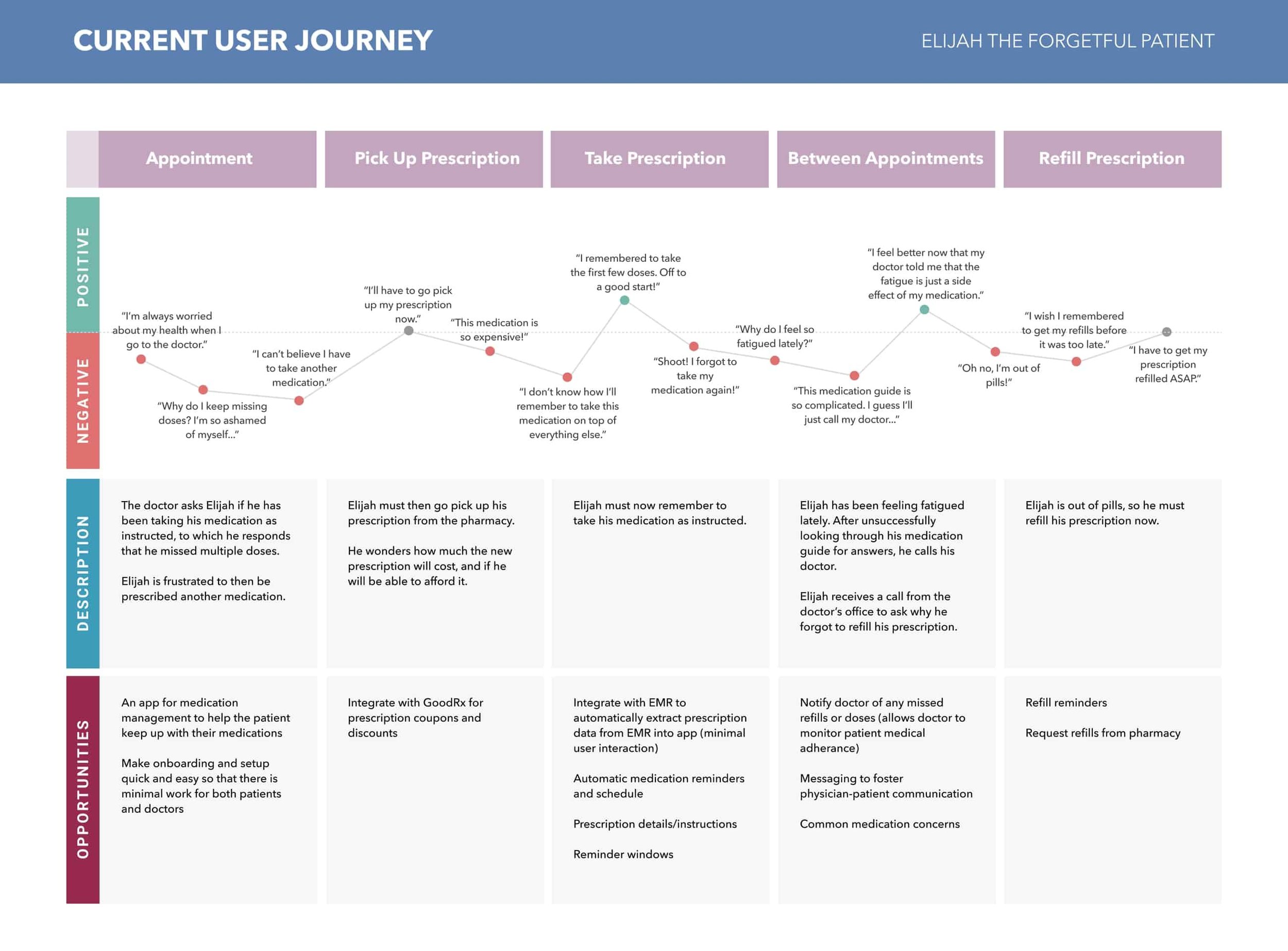
STEP 4: Journey Map
I created a journey map to visualize the current patient experience, and then figure out how to best fix it.
Reflection
This project challenged me to empathize with a group of people that I was entirely unfamiliar with. Since I did not have access to my target group, I delved deeply into other forms of research that enabled me to piece together the mindset of my end user. Working within these limitations allowed me to expand my empathy and make the most of the resources I had.
Next Steps
Since medication adherence is such a widespread issue, I would like to expand this project to a larger target audience through increasing user testing and designing more features. The next steps are:
Increase involvement of end users in further iterations
Design interfaces for prescription scanning and manual entry
Create onboarding walkthrough steps
